1. Which tessellation did you find more interesting to do? In what ways was it more interesting than the other? Please explain.
I found the rectangular tessellation more interesting to do. It was more interesting because it was harder to make, as I started from scratch. The triangular tessellation was easier because I was able to use a premade picture. Being easy does not make it interesting, however the added detail from using a photograph raises the interest-level slightly.
Look at your peers' work on the ning . Which two designs do you find the most successful? What qualities make them so successful?
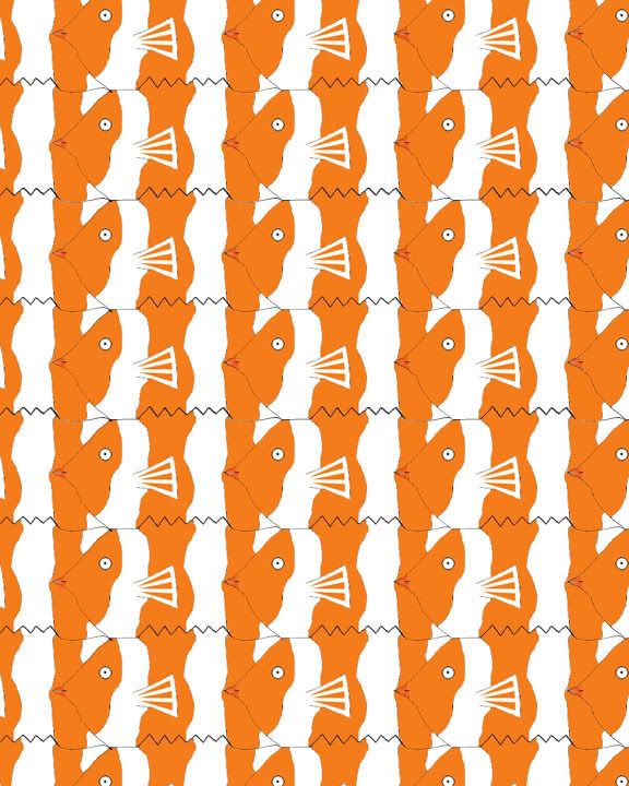
I feel that Devin’s triangle tessellation and Tom’s rectangle tessellation are the most successful tessellations. I really like how Devin used both in- and out-of-focus parts of the photograph and how it draws attention to the edges. I like how Tom’s clearly shows a fish, but I would definitely make the lines between the head and tail-fin bolder. The shape that he used is cool looking and different from all the other shapes I saw used.
Looking at the Grading Criteria for each design, how would you rate BOTH designs on a scale of 1-4, 4 being the highest? Please explain each grade.
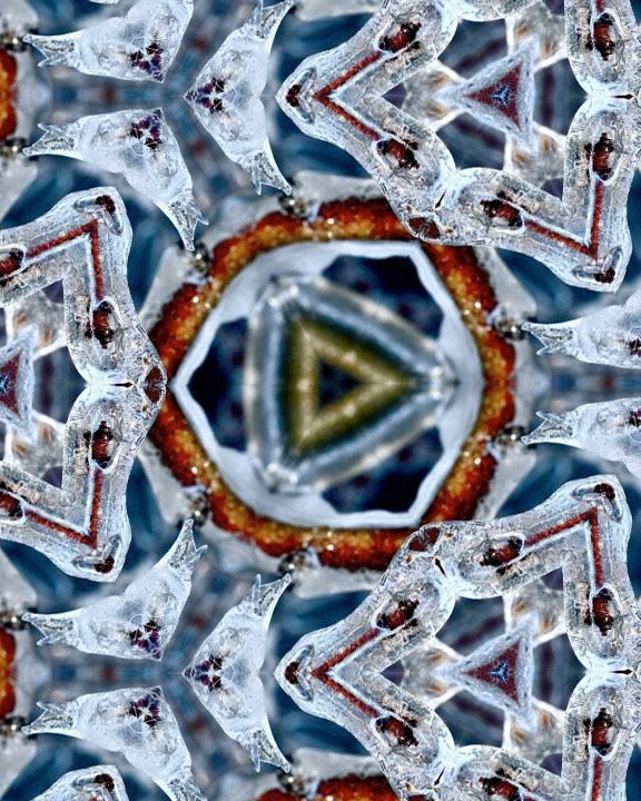
I believe that I deserve a 3.5 on my rectangle tessellation because the shape is clearly that of a bear. I tried to stay away from using too much detail in each shape to keep it simple, but I am glad I used different colors of bears, symbolizing black bears, brown bears, and polar bears. I think that I deserve a 3 on the triangle tessellation. I was aiming for more detail with this one, but when I scaled it down to allow more tessellations to fit some of that detail was lost.