Thursday, February 26, 2009

Text Design


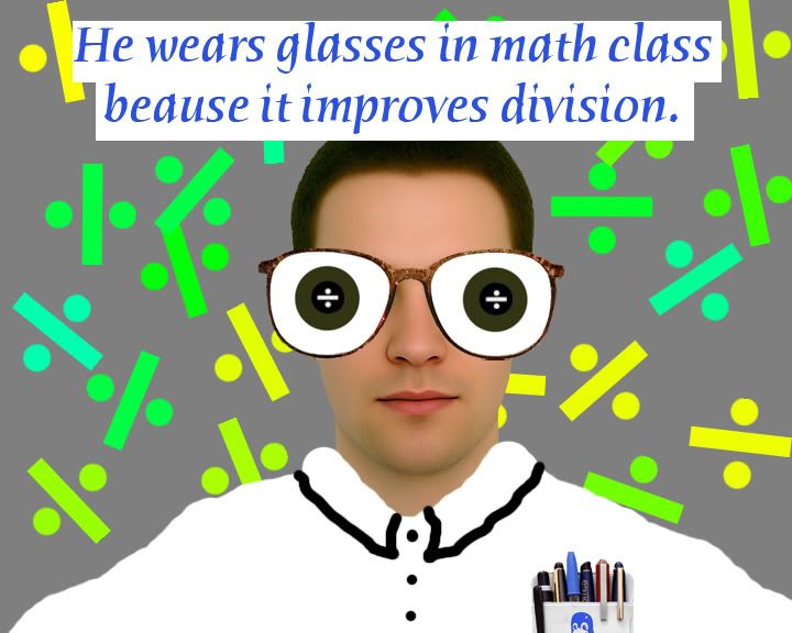
Which one of the four of your Text Designs is the most successful? In what ways? Please be specific.
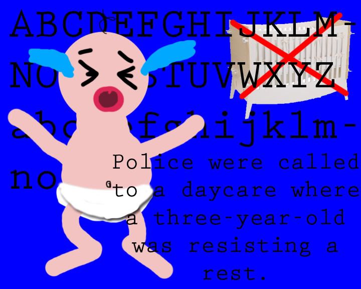
I think that my most successful text design is the baby one. I like it because I drew the baby myself, instead of just taking a pre-made image. The only thing I don’t like about it is the background. The deadline was too soon to make my own, so I used a rounder font (“Child’s Play”) and typed in the alphabet. I also cut out a crib from an online image and included it.

List some of the tools that you learned and used in this assignment. Which ones did you find the most helpful and in what ways?

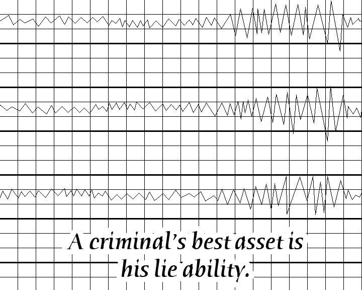
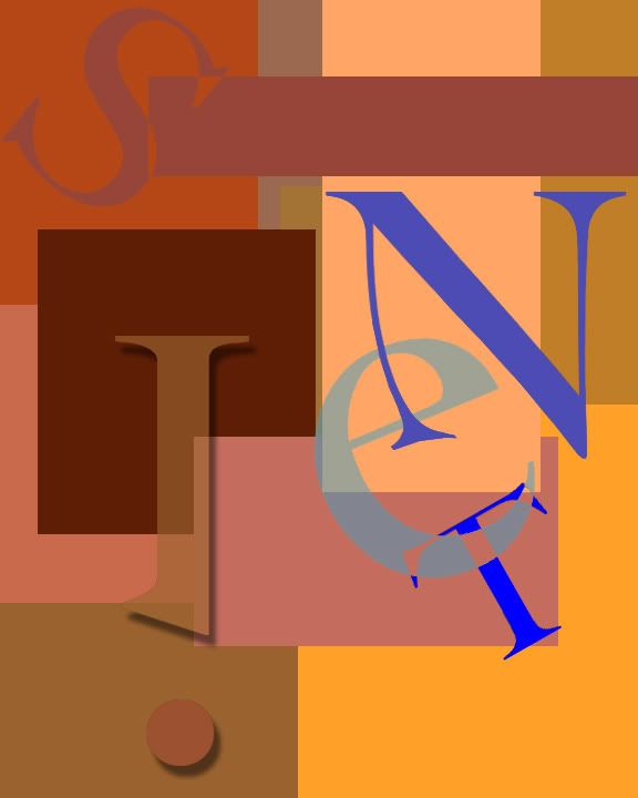
For the lie detector design, I made a custom pattern for the background. I didn’t want to draw the entire grid manually. It would have taken forever to measure out the distance between each line to get them spaced perfectly. It saved me a ton of time which I put in to the other designs.

With regards to Design concepts and/or Photoshop tools, what do you think you need to know and what do you want to know?

I think that more time would have been helpful. I also think that I should know better color schemes instead of looking them up. I want to know how to use the pen tool more efficiently. I believe that it would also be beneficial if I knew how to use more image adjustments.

Friday, February 6, 2009

Text Type Design

Click for Full-Size


Are you happy/satisfied with your design? What are some of the features that make it so successful? If you are not satisfied, what would you have done differently to make it more successful?
I am very happy with my final product. I like the way that I use the blue to create high contrast from the reds. I also feel that the spacing between the letters feels “natural.” Lastly, the “see through” effect I created by painting over the spaces where the “e” and “T” intersect is, in my opinion, really cool.

List some of the tools that you learned and used in this assignment. Which ones did you find the most helpful and in what ways?
First I created a custom brush for the background. I also changed the opacity in layer properties for the “e.” The most helpful tool I used, however, was Hue and Saturation. It allows me to change the colors very easily in one step.

With what areas/aspects of Photoshop do you have questions? What activities would help you better understand basic design concepts, along with more Photoshop tools, tips, and tricks?
I think that we should spend some time on custom brushes. When used correctly, a custom brush can make lots of tasks easier. They can be used to create random patterns for backgrounds of pieces. I used a custom brush to create my logo-type design and it made it extremely easy.

Monday, February 2, 2009

Pop Art

What is pop-art?
Pop art is an artistic style using popular and easily recognizable items from everyday life. It originated in England during the 1950s and became popular in the United States during the '60s.

Who is Stuart Davis?
Stuart Davis was the son of the art director of a newspaper in Philadelphia. He worked for The Masses, a social publication. He did a lot with watercolors and Cubism. Later, he introduced text to his completely abstract patterns which he claimed were based on the reality of what he saw in America.
Percolator by Stuart Davis. 1927.
I chose to feature this painting of Davis' because it caught my eye. The first thing I noticed was the name as I was scrolling through a short gallery, just as I took the last sip left in my Starbucks mug. I was intrigued when I looked at the piece by the barely-recognizable shape of a percolator.

Who is Robert Indiana?
Robert Indiana's father, who worked at "Phillips 66 Gas" left him and his mom down Route 66. Signs became a big thing for Indiana. While living on the waterfront of New York, he presented his first paintings, which were vibrant reflections of common roadside signs.
Ahava by Robert Indiana. 1993.
I like Ahava because of the idea behind it. Ahava means love in Hebrew and Indiana used the color scheme of the Israeli flag. I also chose it because not very many people understand what it is, and it just looks like organic shapes.