
Are you happy/satisfied with your design? What are some of the features that make it so successful? If you are not satisfied, what would you have done differently to make it more successful?
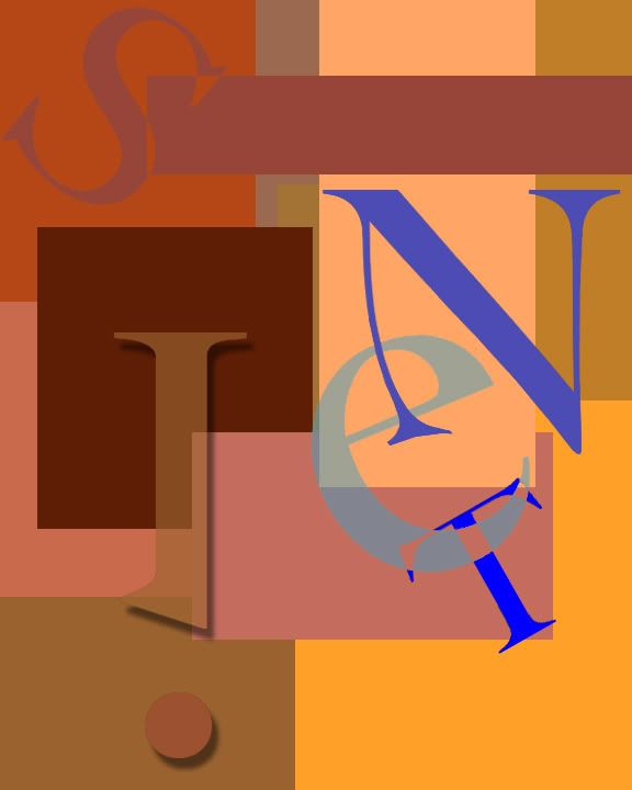
I am very happy with my final product. I like the way that I use the blue to create high contrast from the reds. I also feel that the spacing between the letters feels “natural.” Lastly, the “see through” effect I created by painting over the spaces where the “e” and “T” intersect is, in my opinion, really cool.
List some of the tools that you learned and used in this assignment. Which ones did you find the most helpful and in what ways?
First I created a custom brush for the background. I also changed the opacity in layer properties for the “e.” The most helpful tool I used, however, was Hue and Saturation. It allows me to change the colors very easily in one step.
With what areas/aspects of Photoshop do you have questions? What activities would help you better understand basic design concepts, along with more Photoshop tools, tips, and tricks?
I think that we should spend some time on custom brushes. When used correctly, a custom brush can make lots of tasks easier. They can be used to create random patterns for backgrounds of pieces. I used a custom brush to create my logo-type design and it made it extremely easy.
1 comment:
I like it! Nice color scheme.
Post a Comment