
Five important steps in creating a logo:
First, figure out what the company does and how you want to represent it in the logo.
Second, make a plan for the logo. This could include a description or sketches.
Third, transfer or remake the plan/sketch into an image editor.
Next, make sure that the logo is going in the direction the client wants it to.
Lastly, change anything the client is unhappy with and finalize the design.
Monday, March 30, 2009


Thursday, March 26, 2009
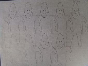
Rectangle and Triangle Tessellations


I found the rectangular tessellation more interesting to do. It was more interesting because it was harder to make, as I started from scratch. The triangular tessellation was easier because I was able to use a premade picture. Being easy does not make it interesting, however the added detail from using a photograph raises the interest-level slightly.
Look at your peers' work on the ning . Which two designs do you find the most successful? What qualities make them so successful?


I feel that Devin’s triangle tessellation and Tom’s rectangle tessellation are the most successful tessellations. I really like how Devin used both in- and out-of-focus parts of the photograph and how it draws attention to the edges. I like how Tom’s clearly shows a fish, but I would definitely make the lines between the head and tail-fin bolder. The shape that he used is cool looking and different from all the other shapes I saw used.
Looking at the Grading Criteria for each design, how would you rate BOTH designs on a scale of 1-4, 4 being the highest? Please explain each grade.
I believe that I deserve a 3.5 on my rectangle tessellation because the shape is clearly that of a bear. I tried to stay away from using too much detail in each shape to keep it simple, but I am glad I used different colors of bears, symbolizing black bears, brown bears, and polar bears. I think that I deserve a 3 on the triangle tessellation. I was aiming for more detail with this one, but when I scaled it down to allow more tessellations to fit some of that detail was lost.
Friday, March 20, 2009
Introduction to Tesselations
What is a tessellation?
A tessellation is a picture made of the repetition of shapes or objects.
Write a couple of paragraphs describing the life and work of M.C. Escher. Pick out important facts that describe who he is, how he worked, and why he is famous.
M. C. Escher was born in 1898 in Holland. He had an interest in pen and ink drawing from a young age, and when his art teacher noticed he taught him how to make linocuts, a form of printing which uses carved linoleum. He was so good that he sent some of his works to Roland Holtz, the most prominent graphic designer at the time.
When Escher began failing his school assessments, Holtz told him to become an architect. He enrolled in Haarlem in the School for Architecture and Decorative Arts in 1918, where his talent was recognized and he was switched out of nature drawing class so he could spend more time wood cutting.
He became famous with his landscape work while he was living in Italy. His first real tessellation, Lions, did not impress most people. He kept playing with his designs and sketches and began purposely
Monday, March 16, 2009
Doodle for Google

Circuitry
I wish for all children in the world to have access to technology. Technology is growing rapidly, and it is clear that it plays, and will continue to play, a vital role in everyday life. Some feedback I received from my peers was to connect the E to the L and to make the yellow O stand out. As you can see, I didn’t connect my L to my E. I feel that the difference sets off the design. I learned how to use a stylized design (in this case, circuitry) in my design effectively. I also learned how to make the letters clear and readable easily. I feel that I deserve a four out of four because my design definitely complements the Google letters. It is also extremely simple, using only the letters and nothing else.

Alternative
I wish that people would switch to alternative energy sources to prevent pollution to our planet. I did not receive any feedback on this piece. I learned how to use the line (shape) tool effectively. I also learned to use feathering. I feel that I deserve a three because the colors work well and there is a definite theme. It is not very complicated, with only a few ideas.
Tuesday, March 10, 2009
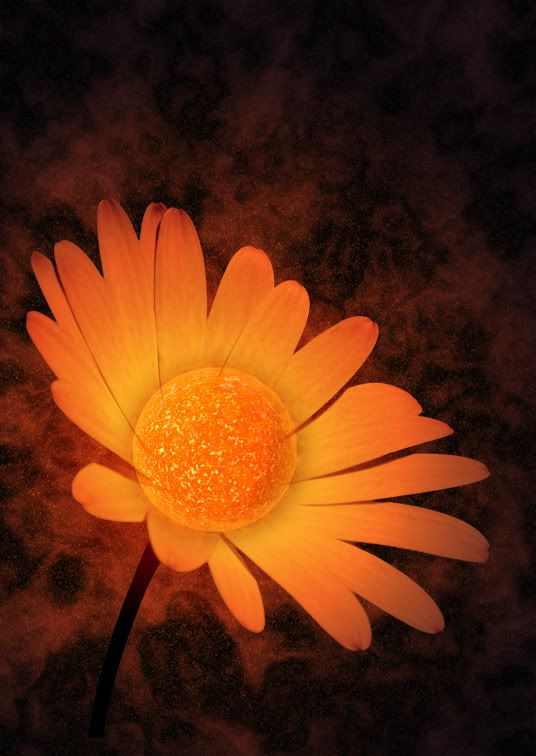
I read about an interesting experiment done where two disposable cameras were left on a park bench with a note saying to just take pictures and have fun. I'm going to do some editing to photos using photoshop.
The post I read can be found here.
Sun stock is the work of Lish and the flower stock is the work of Sourcow
Subscribe to:
Posts (Atom)